
Which calls to action (CTAs) will boost your store locator?
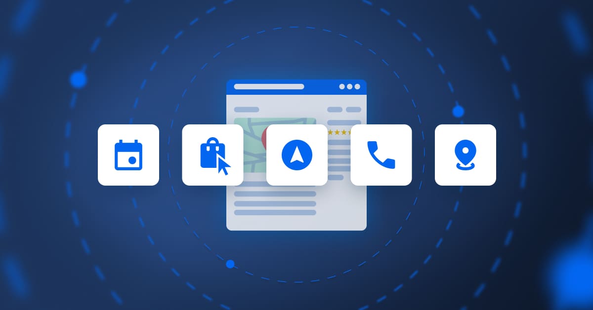
Table of contents
A call to action (CTA) is a key part of the conversion funnel and prompts online users to take a specific action. On a store locator, it’s a crucial link between your digital presence and your physical stores, as without clear, strategic incentives, your pages will be no more than stagnant directories.
To maximise your conversion rate, you need to tailor your CTAs to match user intent. Read on to find out all you need to know!
1. Informational CTAs to reassure the user before they head to your outlet
These buttons are for users who are in the discovery stage. This type of CTA gets a prospect thinking about what you offer before they reach the paying customer stage. They’re essential for informational searches, where the user checks out different options.
Examples of informational CTAs include:
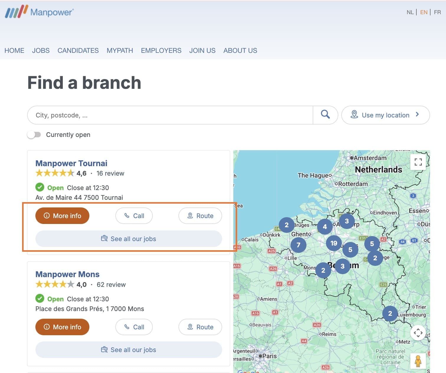
- A “Store information” button that sends the user to that establishment‘s local page. This is where they’ll find key information to prepare their visit (precise contact details, up-to-date opening hours, appealing photos, customer reviews, or the specific services available in store).
- “Register for events”: ideal for brands holding workshops or product launches, this CTA helps strengthen an outlet’s human and community side of things.
2. Conversion CTAs that grab customers’ attention early on
A conversion CTA lets you engage the customer through practical, measurable steps before they pop into your store. These CTAs make it easier for prospects to get in touch (via email, phone, etc.), so you connect with them early on and reduce the risk of them using a competitor.
- “Book an appointment”: this type of CTA is essential for service sectors (banks, opticians, garages, hairdressers, etc.). Plus, if you integrate an appointment booking tool, you’ll maximise conversions and prevent them from going elsewhere.
- “Reserve in store” / “Click & Collect”: this CTA secures a product or service sale remotely and streamlines the purchase journey by removing any uncertainty about availability. As well as immediately reassuring a prospect, it drives qualified in-store traffic, because once you’ve got the customer in your outlet, they may make additional purchases.
- “Call”: this is a mobile-first CTA so smartphone users can call a store in a couple of clicks. This button makes it easy for them to get in touch and is therefore essential for conversion.
3. Navigation CTAs to prompt immediate decision making
This type of CTA is the driving force of a store locator. Navigation CTAs are designed to physically guide the customer to an outlet by using geolocation tools. On mobile devices, they activate GPS navigation for real-time guidance, while desktop users can find an outlet on an interactive map (for example, Google Maps or Apple Maps).
They are the final strategic web-to-store step in the conversion funnel, transforming a digital search intent into an in-person visit.
- “Directions” or “How to get there”: This is the most clicked CTA because it meets an immediate local intention. Another essential mobile-first feature, it launches the user’s default navigation app for a “door-to-door” journey.
- “Find us”: This is generally a desktop CTA where users can open an interactive map and find the location of an outlet in a particular neighbourhood or town. It’s essential when a customer is preparing a trip to a store: they can check out access, nearby car parks or see what other stores are in the area before they head out.
- “Share address”: This CTA lets you send your contact details by SMS, email, or on a messaging app (WhatsApp, Messenger). Although often overlooked, it’s a useful feature for group outings (restaurants, leisure) because it turns users into advocates, makes planning together easier, and boosts valuable online word-of-mouth.
Why are CTAs a store locator must?
1. Improve the user experience and reduce pain points
A store locator often proves its worth at the end of the purchase process when intent is at its highest. A well-placed “Directions” button means the user doesn’t have to copy/paste or scribble down an address, making it easier to visit an establishment. In cognitive psychology, the lower the effort required, the more likely people are to act.
2. Drive web-to-store conversion
CTAs act as a bridge between the digital and physical world. By offering a “Book an appointment” option, you engage the customer in a formal process, which greatly increases in-store visits. This means your store locator is more than just a list of outlets, but a high-added-value tool that drives qualified business.
3. Track key performance indicators (KPIs)
With CTA click tracking, your teams can measure how effective a store locator is. You can, for example, analyse the exact number of calls or directions requests and calculate the cost per in-store visit. Without this data, you can’t properly assess how optimising your store locator contributes to improving your local SEO.
4. Boost your SEO and GEO
Traditional and GenAI search engines analyse user behaviour. A high click-through rate on your CTAs, therefore, sends them a “relevance” signal. If users frequently click on “Directions” or “Call” after landing your page, the algorithm deduces that your establishment perfectly meets the search intent and displays it in results.
The most frequent questions about a store locator’s CTAs
There’s no hard and fast rule, but we recommend a max of two to three CTAs per outlet. Just adding one button is too restrictive because the search intent is usually broad (some people want info, others want to call). You can, for example, visually highlight a main CTA and add one or two more discreet secondary CTAs. It’s best to limit CTAs to no more than three, as too many can dilute the user’s attention.
The answer is yes! Nowadays, a mobile-first or mobile-friendly site is a must to stand out online. For example, you can add the “click-to-call” or “directions” CTA on a store locator’s mobile version. However, for desktop versions, prioritise “book and appointment” or “complete the form” CTAs as desktop users are often in a planning mindset.
If possible, above the fold*. The CTA should be visible without needing to scroll down, ideally next to the store name or address. Adding a directions button to the interactive map is also a clever idea because it follows a natural visual logic.
*Refers to the area visible to the user without having to scroll down a page.
A CTA is considered effective when it reduces “cognitive friction”, as in the mental effort required for users to understand what will happen after they click. The more obvious the action, the smoother the conversion. Use clear, action-oriented language that guides the user towards the next step. Opt for”Get directions” rather than a simple “Address”, or “Call” instead of “Phone number”.
By Partoo
You are one click away from success
Want to easily develop your business through the Internet? It’s possible thanks to Partoo!
Stay one step ahead!
Download the 2026 Barometer on online presence and e-reputation of businesses and gain practical insights to increase your chances of being cited by AI.
Subscribe to our newsletter
Receive our best articles and practical guides directly in your inbox every month